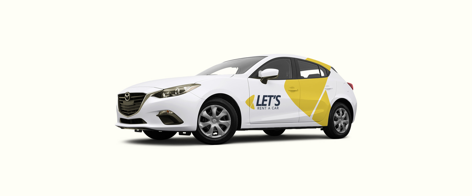
The development of this Branding Project was the result of the company’s purpose and values and its young, transparent and easy to understand personality. Identity is based on speed, ease and convenience.
At the graphic level this personality is represented by its boomerang symbol which translates to no-hassle, hassle-free and convenient delivery and collection anywhere, anytime.
Website Layout Design (not yet online) has been a lot of research and testing to find the best navigation and user experience.